AI Travel Planner

AI Travel Planner

AI Travel Planner

Exploring how AI can reduce decision fatigue in travel planning

Exploring how AI can reduce decision fatigue in travel planning

OVERVIEW

OVERVIEW

OVERVIEW

Before moving into product design, I worked in the travel industry. I saw the same pattern over and over. People spent hours researching destinations, comparing options, and building itineraries, yet many still felt uncertain about the choices they made.

That experience inspired this project.


Rather than creating another travel booking app, I explored how AI could become a planning partner that helps people make better decisions with less effort. The goal was not to replace human curiosity. It was to reduce research overload so travelers could spend more time looking forward to their trip and less time organizing it.


I led the project from research through high-fidelity prototyping, using user research, rapid iteration, and usability testing to validate each design decision.

ROLE

Solo UX Designer

End-to-end, Research to high-fidelity prototype

Independent Product Exploration

TIMELINE

10 Weeks

TARGET USERS

Professional, Frequent, and Occasional Travelers

IMPACTS

Usability Score Increased from 40% to 66%


Task Completion Improved from 67% to 80%


Validated through two rounds of usability testing

UX METHODS

Usability Scores from Maze

Priority Matrix

Affinity Mapping

TOOLS

Figma

Miro

Qualtrics for research

Maze for user testing

ROLE

Solo UX Designer

End-to-end, Research to high-fidelity prototype

Independent Product Exploration

UX METHODS

Usability Scores from Maze

Priority Matrix

Affinity Mapping

TIMELINE

10 Weeks

TARGET USERS

Professional, Frequent, and Occasional Travelers

TOOLS

Figma

Miro

Qualtrics for research

Maze for user testing

IMPACTS

Usability Score Increased from 40% to 66%


Task Completion Improved from 67% to 80%


Validated through two rounds of usability testing

ROLE

Solo UX Designer

End-to-end, Research to high-fidelity prototype

Independent Product Exploration

UX METHODS

Usability Scores from Maze

Priority Matrix

Affinity Mapping

TIMELINE

10 Weeks

TARGET USERS

Professional, Frequent, and Occasional Travelers

TOOLS

Figma

Miro

Qualtrics for research

Maze for user testing

IMPACTS

Usability Score Increased from 40% to 66%


Task Completion Improved from 67% to 80%


Validated through two rounds of usability testing

The Problem

The Problem

The Problem

Planning a trip often feels like solving a puzzle. Travelers jump between search engines, blogs, maps, reviews, and booking platforms before they can answer a simple question: "What should I actually do?"


The problem isn't a lack of travel information. It's that people are expected to organize, compare, and prioritize everything themselves.

I wanted to explore whether AI could act as the missing thinking layer between travelers and the overwhelming amount of information already available.

Planning a trip often feels like solving a puzzle. Travelers jump between search engines, blogs, maps, reviews, and booking platforms before they can answer a simple question: "What should I actually do?"


The problem isn't a lack of travel information. It's that people are expected to organize, compare, and prioritize everything themselves.

I wanted to explore whether AI could act as the missing thinking layer between travelers and the overwhelming amount of information already available.

Planning a trip often feels like solving a puzzle. Travelers jump between search engines, blogs, maps, reviews, and booking platforms before they can answer a simple question: "What should I actually do?"


The problem isn't a lack of travel information. It's that people are expected to organize, compare, and prioritize everything themselves.

I wanted to explore whether AI could act as the missing thinking layer between travelers and the overwhelming amount of information already available.

The Goal

The Goal

The Goal

Design a solution that simplifies trip planning, enabling travelers to create enjoyable and efficient itineraries with ease, by leveraging AI.


Help users discover activities of interest, organize their plans, and balance preferences, while offering destination insights and local recommendations.

Design a solution that simplifies trip planning, enabling travelers to create enjoyable and efficient itineraries with ease, by leveraging AI.


Help users discover activities of interest, organize their plans, and balance preferences, while offering destination insights and local recommendations.

Design a solution that simplifies trip planning, enabling travelers to create enjoyable and efficient itineraries with ease, by leveraging AI.


Help users discover activities of interest, organize their plans, and balance preferences, while offering destination insights and local recommendations.

Research

Research

Research

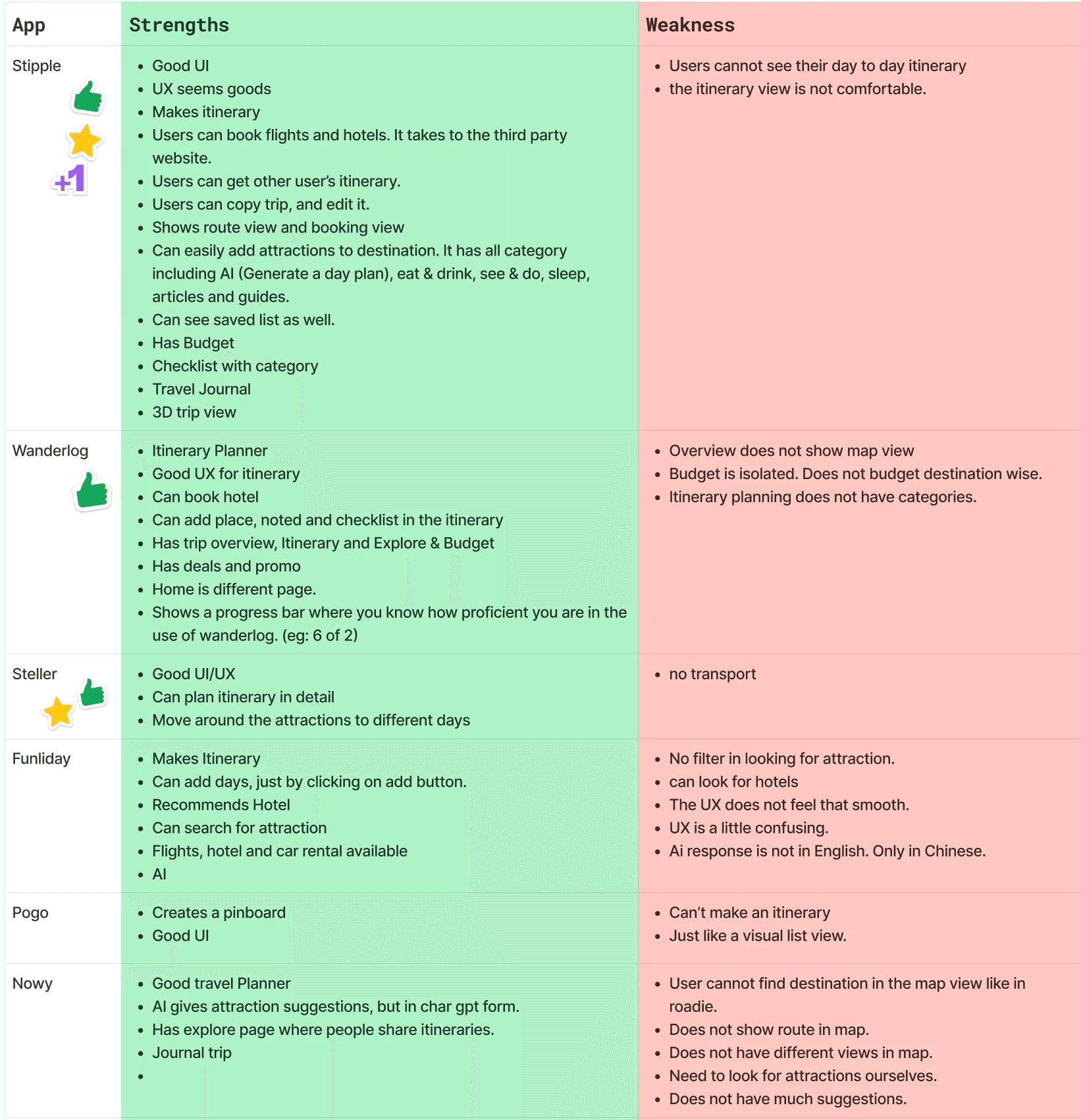
To better understand the problem, I surveyed 16 travelers and evaluated 11 travel apps. Three themes appeared consistently.


These findings shaped the first version of the product. Instead of building a large feature set, I focused on three capabilities:

• A simple five-step planning flow

• AI-generated itinerary recommendations

• A clear separation between itinerary and map views

Discovery was fragmented

Discovery was fragmented

Users struggled to find activities that matched both their interests and the time they actually had available.

Too much information created more work

Too much information created more work

Most apps presented endless lists without helping users prioritize what mattered.

Users lacked confidence

Users lacked confidence

Without understanding travel times or how activities fit together, people questioned whether their itineraries were even realistic.

Priority matrix

Priority matrix

Priority matrix

Affinity Mapping

Affinity Mapping

Affinity Mapping

Product Principles

Product Principles

Product Principles

AI Should Reduce Thinking, Not Replace It: Recommendations should narrow choices instead of making decisions for users.


Clarity Before Features: Every screen should answer one question at a time.


Context Builds Trust: Maps, travel times, and local information help users evaluate AI recommendations with confidence.


Start Small: The MVP focused only on the planning journey. Features that added complexity without improving first-time use were intentionally deferred.

AI Should Reduce Thinking, Not Replace It: Recommendations should narrow choices instead of making decisions for users.


Clarity Before Features: Every screen should answer one question at a time.


Context Builds Trust: Maps, travel times, and local information help users evaluate AI recommendations with confidence.


Start Small: The MVP focused only on the planning journey. Features that added complexity without improving first-time use were intentionally deferred.

AI Should Reduce Thinking, Not Replace It: Recommendations should narrow choices instead of making decisions for users.


Clarity Before Features: Every screen should answer one question at a time.


Context Builds Trust: Maps, travel times, and local information help users evaluate AI recommendations with confidence.


Start Small: The MVP focused only on the planning journey. Features that added complexity without improving first-time use were intentionally deferred.

Key Design Decisions

Key Design Decisions

Key Design Decisions

These three decisions had the clearest impact on usability. Each one came directly from observed user behavior and was validated through testing.

These three decisions had the clearest impact on usability. Each one came directly from observed user behavior and was validated through testing.

These three decisions had the clearest impact on usability. Each one came directly from observed user behavior and was validated through testing.

01 — Replace the Walkthrough with Contextual Guidance

01 — Replace the Walkthrough with Contextual Guidance

01 — Replace the Walkthrough with Contextual Guidance

THE PROBLEM

THE PROBLEM

During the first round of testing, 67% of participants were unsure where to begin.

My initial response was to create a walkthrough that explained the experience before users entered the core flow. After reviewing the interaction, I realized the walkthrough was solving the wrong problem. It added another step instead of making the interface itself clearer.

During the first round of testing, 67% of participants were unsure where to begin.

My initial response was to create a walkthrough that explained the experience before users entered the core flow. After reviewing the interaction, I realized the walkthrough was solving the wrong problem. It added another step instead of making the interface itself clearer.

During the first round of testing, 67% of participants were unsure where to begin.

My initial response was to create a walkthrough that explained the experience before users entered the core flow. After reviewing the interaction, I realized the walkthrough was solving the wrong problem. It added another step instead of making the interface itself clearer.

THE DECISION

THE DECISION

I removed the walkthrough and added short, contextual instructions directly within the planning flow.

The guidance appeared at the moment users needed it, close to the relevant action. This allowed people to understand the interface without leaving the task or remembering instructions from an earlier screen.

I removed the walkthrough and added short, contextual instructions directly within the planning flow.

The guidance appeared at the moment users needed it, close to the relevant action. This allowed people to understand the interface without leaving the task or remembering instructions from an earlier screen.

I removed the walkthrough and added short, contextual instructions directly within the planning flow.

The guidance appeared at the moment users needed it, close to the relevant action. This allowed people to understand the interface without leaving the task or remembering instructions from an earlier screen.

THE RESULT

THE RESULT

Task completion increased from 67% to 80% in the second round of testing. The change also reduced hesitation at the start of the experience and helped participants move into planning with less support.

Task completion increased from 67% to 80% in the second round of testing. The change also reduced hesitation at the start of the experience and helped participants move into planning with less support.

Task completion increased from 67% to 80% in the second round of testing. The change also reduced hesitation at the start of the experience and helped participants move into planning with less support.

02 — Separate the Itinerary from the Map

02 — Separate the Itinerary from the Map

02 — Separate the Itinerary from the Map

THE PROBLEM

THE PROBLEM

The first version displayed the itinerary and map together on one screen.Testing showed that participants struggled to understand where to focus.


The activity details competed with route information, creating visual overload and increasing misclicks.

The screen was technically showing more information, but it was helping users understand less.

The first version displayed the itinerary and map together on one screen.Testing showed that participants struggled to understand where to focus.


The activity details competed with route information, creating visual overload and increasing misclicks.

The screen was technically showing more information, but it was helping users understand less.

The first version displayed the itinerary and map together on one screen.Testing showed that participants struggled to understand where to focus.


The activity details competed with route information, creating visual overload and increasing misclicks.

The screen was technically showing more information, but it was helping users understand less.

THE DECISION

THE DECISION

I separated the itinerary and map into two focused views connected by a clear toggle.


The itinerary view supported planning and comparison. The map view provided location and distance context when users needed to evaluate whether the plan was realistic. This reduced the number of decisions users had to make on each screen while keeping both perspectives easy to access.

I separated the itinerary and map into two focused views connected by a clear toggle.


The itinerary view supported planning and comparison. The map view provided location and distance context when users needed to evaluate whether the plan was realistic. This reduced the number of decisions users had to make on each screen while keeping both perspectives easy to access.

I separated the itinerary and map into two focused views connected by a clear toggle.


The itinerary view supported planning and comparison. The map view provided location and distance context when users needed to evaluate whether the plan was realistic. This reduced the number of decisions users had to make on each screen while keeping both perspectives easy to access.

THE RESULT

THE RESULT

First-click accuracy improved and misclicks decreased during the second round of testing. Participants also described the experience as clearer and less overwhelming because they could focus on one task at a time.

First-click accuracy improved and misclicks decreased during the second round of testing. Participants also described the experience as clearer and less overwhelming because they could focus on one task at a time.

First-click accuracy improved and misclicks decreased during the second round of testing. Participants also described the experience as clearer and less overwhelming because they could focus on one task at a time.

03 — Align the Sign-Up Hierarchy with User Behavior

03 — Align the Sign-Up Hierarchy with User Behavior

THE PROBLEM

THE PROBLEM

Heatmap data showed that participants consistently selected “Register with Email,” even though Google sign-up was intended to be the fastest and lowest-friction option.


The issue was not the functionality. It was the hierarchy. The email option had greater visual prominence, so the interface was guiding users toward the slower path.

Heatmap data showed that participants consistently selected “Register with Email,” even though Google sign-up was intended to be the fastest and lowest-friction option.


The issue was not the functionality. It was the hierarchy. The email option had greater visual prominence, so the interface was guiding users toward the slower path.

Heatmap data showed that participants consistently selected “Register with Email,” even though Google sign-up was intended to be the fastest and lowest-friction option.


The issue was not the functionality. It was the hierarchy. The email option had greater visual prominence, so the interface was guiding users toward the slower path.

THE DECISION

THE DECISION

I restructured the screen so Google sign-up became the primary action.


I positioned it earlier in the reading flow, increased its visual emphasis, and treated email registration as a secondary option. This aligned the interface with both the intended product behavior and the way participants naturally scanned the screen.

I restructured the screen so Google sign-up became the primary action.


I positioned it earlier in the reading flow, increased its visual emphasis, and treated email registration as a secondary option. This aligned the interface with both the intended product behavior and the way participants naturally scanned the screen.

I restructured the screen so Google sign-up became the primary action.


I positioned it earlier in the reading flow, increased its visual emphasis, and treated email registration as a secondary option. This aligned the interface with both the intended product behavior and the way participants naturally scanned the screen.

THE RESULT

THE RESULT

No participants dropped off at the sign-up step during the second round of testing. The revised hierarchy created a faster entry into the product and removed a point of friction that had previously interrupted the core journey.

No participants dropped off at the sign-up step during the second round of testing. The revised hierarchy created a faster entry into the product and removed a point of friction that had previously interrupted the core journey.

No participants dropped off at the sign-up step during the second round of testing. The revised hierarchy created a faster entry into the product and removed a point of friction that had previously interrupted the core journey.

The Results

The Results

The Results

After two rounds of usability testing with 12 participants, the experience became significantly easier to use. The biggest improvement wasn't simply the numbers. Participants stopped feeling lost. Instead of wondering what to do next, they moved confidently through the experience and focused on planning their trip.

After two rounds of usability testing with 12 participants, the experience became significantly easier to use. The biggest improvement wasn't simply the numbers. Participants stopped feeling lost. Instead of wondering what to do next, they moved confidently through the experience and focused on planning their trip.

After two rounds of usability testing with 12 participants, the experience became significantly easier to use. The biggest improvement wasn't simply the numbers. Participants stopped feeling lost. Instead of wondering what to do next, they moved confidently through the experience and focused on planning their trip.

40% → 66%

Usability Score

Lower

Misclick Rate

67% → 80%

Task Completion

Faster

Core Task Completion

Reflection

Reflection

Reflection

This project reinforced something I believe about AI products. People don't need AI to make decisions for them. They need AI to reduce complexity, organize information, and help them make confident decisions themselves.


Designing AI products isn't only about building intelligent features. It's about designing trust. That mindset continues to shape how I approach AI-assisted experiences today.

This project reinforced something I believe about AI products. People don't need AI to make decisions for them. They need AI to reduce complexity, organize information, and help them make confident decisions themselves.


Designing AI products isn't only about building intelligent features. It's about designing trust. That mindset continues to shape how I approach AI-assisted experiences today.

This project reinforced something I believe about AI products. People don't need AI to make decisions for them. They need AI to reduce complexity, organize information, and help them make confident decisions themselves.


Designing AI products isn't only about building intelligent features. It's about designing trust. That mindset continues to shape how I approach AI-assisted experiences today.

What’s Next?

What’s Next?

What’s Next?

The next phase is expanding the planner beyond individual trip creation. I'd explore collaborative itinerary planning for groups, smarter budget recommendations, and analytics to better understand how travelers interact with AI-generated suggestions over time.


I'm also interested in how modern AI agents could make the experience more conversational. Rather than asking users to fill out forms, an AI assistant could gather preferences through natural conversation, refine recommendations as plans evolve, and adapt itineraries in real time while still giving travelers full control over the final decisions. Those ideas would be validated through additional user research and testing before becoming part of the product.

The next phase is expanding the planner beyond individual trip creation. I'd explore collaborative itinerary planning for groups, smarter budget recommendations, and analytics to better understand how travelers interact with AI-generated suggestions over time.


I'm also interested in how modern AI agents could make the experience more conversational. Rather than asking users to fill out forms, an AI assistant could gather preferences through natural conversation, refine recommendations as plans evolve, and adapt itineraries in real time while still giving travelers full control over the final decisions. Those ideas would be validated through additional user research and testing before becoming part of the product.

The next phase is expanding the planner beyond individual trip creation. I'd explore collaborative itinerary planning for groups, smarter budget recommendations, and analytics to better understand how travelers interact with AI-generated suggestions over time.


I'm also interested in how modern AI agents could make the experience more conversational. Rather than asking users to fill out forms, an AI assistant could gather preferences through natural conversation, refine recommendations as plans evolve, and adapt itineraries in real time while still giving travelers full control over the final decisions. Those ideas would be validated through additional user research and testing before becoming part of the product.

Copyright © 2024. Silu Manandhar

Copyright © 2024. Silu Manandhar