Lose It! Themes

Lose It! Themes

Lose It! Themes

Making premium personalization usable at daily scale

Making premium personalization usable at daily scale

Making premium personalization usable at daily scale

OVERVIEW

OVERVIEW

OVERVIEW

I led the visual design of a 28-theme personalization system for Lose It!’s premium experience. It was a app wide redesign, defining the template, color decisions, accessibility rules, and selector experience so each theme felt expressive without compromising the health data people rely on every day.

I led the visual design of a 28-theme personalization system for Lose It!’s premium experience. It was a app wide redesign, defining the template, color decisions, accessibility rules, and selector experience so each theme felt expressive without compromising the health data people rely on every day.

I led the visual design of a 28-theme personalization system for Lose It!’s premium experience. It was a app wide redesign, defining the template, color decisions, accessibility rules, and selector experience so each theme felt expressive without compromising the health data people rely on every day.

ROLE

ROLE

Visual design lead
Theme system
Theme selector
Accessibility QA

TEAM

TEAM

2 designers, PM, iOS, Android, and engineering partners

2 designers, PM, iOS, Android, and engineering partners

PLATFORM

PLATFORM

Lose It! Premium
iOS, iPadOS, and Android

IMPACT

IMPACT

Repeatable system for 28 themes, with adoption tracked in Amplitude

TIMELINE

TIMELINE

8-week design and implementation track

ROLE

Visual design lead
Theme system
Theme selector
Accessibility QA

PLATFORM

Lose It! Premium
iOS, iPadOS, and Android

TIMELINE

8-week design and implementation track

TEAM

2 designers, PM, iOS, Android, and engineering partners

IMPACT

Repeatable system for 28 themes, with adoption tracked in Amplitude

Problem: personalization had to protect the data comprehnesion

Problem: personalization had to protect the data comprehnesion

Problem: personalization had to protect the data comprehnesion

Lose It! is opened multiple times a day, which means visual changes cannot be treated like decoration. A theme might create delight on first launch, but if it makes calories, streaks, or progress harder to read, it fails the product.

The challenge was to make premium feel more personal while keeping the app fast, familiar, and accessible. Thirty distinct themes, holidays, seasons, cultural moments, and moods, needed to work inside one product system without becoming thirty one-off designs.

Lose It! is opened multiple times a day, which means visual changes cannot be treated like decoration. A theme might create delight on first launch, but if it makes calories, streaks, or progress harder to read, it fails the product.

The challenge was to make premium feel more personal while keeping the app fast, familiar, and accessible. Thirty distinct themes, holidays, seasons, cultural moments, and moods, needed to work inside one product system without becoming thirty one-off designs.

Lose It! is opened multiple times a day, which means visual changes cannot be treated like decoration. A theme might create delight on first launch, but if it makes calories, streaks, or progress harder to read, it fails the product.

The challenge was to make premium feel more personal while keeping the app fast, familiar, and accessible. Thirty distinct themes, holidays, seasons, cultural moments, and moods, needed to work inside one product system without becoming thirty one-off designs.

Old Cats Theme - Android

Old Cats Theme - Android

Old Cats Theme - Android

Constraints that shaped the system

Constraints that shaped the system

Constraints that shaped the system

  • Every theme had to pass contrast standards for data and text over themed surfaces.

  • Themes had to plug into the redesign system without custom components or special-casing.

  • Cultural and seasonal themes needed to feel specific and respectful, not generic or stereotyped.

  • The workflow had to scale so future themes could ship without reopening the design system.

Goal: build a repeatable personalization framework

Goal: build a repeatable personalization framework

Goal: build a repeatable personalization framework

Design a scalable theme system where every theme preserves clarity, passes accessibility checks, and gives premium users a daily sense of ownership.

Design a scalable theme system where every theme preserves clarity, passes accessibility checks, and gives premium users a daily sense of ownership.

Design a scalable theme system where every theme preserves clarity, passes accessibility checks, and gives premium users a daily sense of ownership.

WCAG CONTRAST

WCAG CONTRAST

Text & data over every themed header must pass accessibility standards

CULTURAL AUTHENTICITY

CULTURAL AUTHENTICITY

Celebrated, not stereotyped

ONE DESIGN SYSTEM

ONE DESIGN SYSTEM

Themes plug into redesign components, no special-casing.

Themes plug into redesign components, no special-casing.

SCALABLE

SCALABLE

New themes ship cheaply, without redesign work

New themes ship cheaply, without redesign work

WCAG CONTRAST

Text & data over every themed header must pass accessibility standards

ONE DESIGN SYSTEM

Themes plug into redesign components, no special-casing.

CULTURAL AUTHENTICITY

Celebrated, not stereotyped

SCALABLE

New themes ship cheaply, without redesign work

Key design decisions

Key design decisions

Key design decisions

The work was less about drawing 30 beautiful headers and more about defining the rules that made thirty expressions usable, shippable, and maintainable.

The work was less about drawing 30 beautiful headers and more about defining the rules that made thirty expressions usable, shippable, and maintainable.

The work was less about drawing 30 beautiful headers and more about defining the rules that made thirty expressions usable, shippable, and maintainable.

01 — A system, not just 28 artworks

01 — A system, not just 28 artworks

01 — A system, not just 28 artworks

OVERVIEW

OVERVIEW

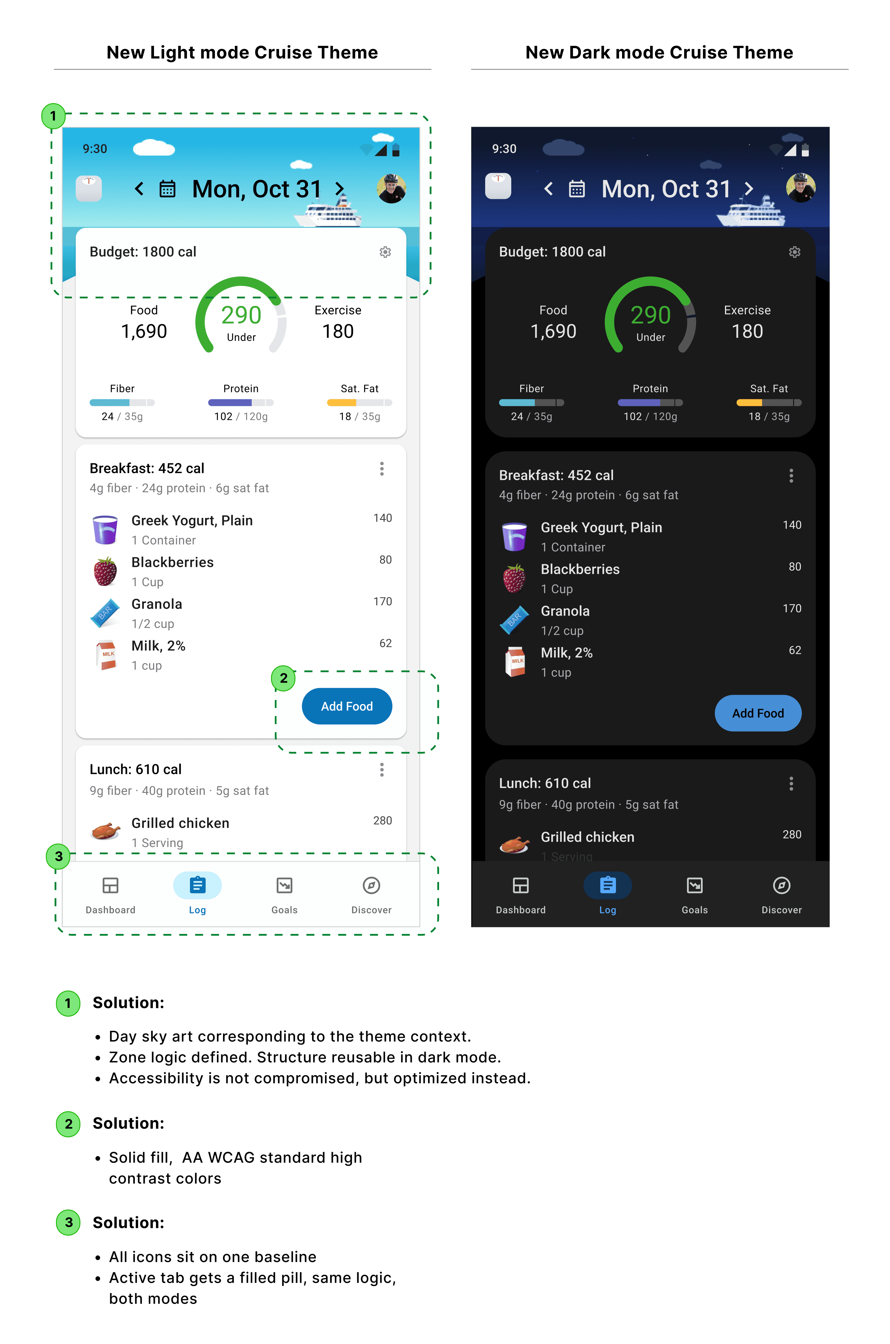
I defined a repeatable theme template with protected zones for data and text, and expressive zones for illustration, color, and seasonal personality. That constraint gave the team creative range without creating thirty different product surfaces.

I defined a repeatable theme template with protected zones for data and text, and expressive zones for illustration, color, and seasonal personality. That constraint gave the team creative range without creating thirty different product surfaces.

I defined a repeatable theme template with protected zones for data and text, and expressive zones for illustration, color, and seasonal personality. That constraint gave the team creative range without creating thirty different product surfaces.

TRADEOFF

TRADEOFF

I chose system resilience over one-off visual richness because personalization in a daily health product has to serve use before novelty. Every theme stayed legible, consistent, and much cheaper to produce.

02 — Accessibility became a design input

02 — Accessibility became a design input

02 — Accessibility became a design input

OVERVIEW

OVERVIEW

Festive palettes are often hostile to readability: saturated reds, yellows, gradients, and illustrated headers can quickly fail contrast checks. I owned the color decisions across the set, tuning palettes and using layered scrims so themes could keep their emotional tone while still protecting the information hierarchy.

Festive palettes are often hostile to readability: saturated reds, yellows, gradients, and illustrated headers can quickly fail contrast checks. I owned the color decisions across the set, tuning palettes and using layered scrims so themes could keep their emotional tone while still protecting the information hierarchy.

Festive palettes are often hostile to readability: saturated reds, yellows, gradients, and illustrated headers can quickly fail contrast checks. I owned the color decisions across the set, tuning palettes and using layered scrims so themes could keep their emotional tone while still protecting the information hierarchy.

TRADEOFF

TRADEOFF

In a health app, the user’s data is the hero. The theme should frame the habit, not compete with it.

In a health app, the user’s data is the hero. The theme should frame the habit, not compete with it.

03 — Cultural themes were researched, not assumed

03 — Cultural themes were researched, not assumed

03 — Cultural themes were researched, not assumed

OVERVIEW

OVERVIEW

Themes like Hanukkah, Pride, Independence Day, and International Women's Day carry meaning. I researched color symbolism, motifs, and visual conventions so each theme felt celebratory and relatable, rather than performative.

That meant asking where a recognizable cue was useful, where restraint was more respectful, and how each theme would feel when used for weeks, not just in a launch screenshot.

Themes like Hanukkah, Pride, Independence Day, and International Women's Day carry meaning. I researched color symbolism, motifs, and visual conventions so each theme felt celebratory and relatable, rather than performative.

That meant asking where a recognizable cue was useful, where restraint was more respectful, and how each theme would feel when used for weeks, not just in a launch screenshot.

Themes like Hanukkah, Pride, Independence Day, and International Women's Day carry meaning. I researched color symbolism, motifs, and visual conventions so each theme felt celebratory and relatable, rather than performative.

That meant asking where a recognizable cue was useful, where restraint was more respectful, and how each theme would feel when used for weeks, not just in a launch screenshot.

04 — The selector became a premium storefront

04 — The selector became a premium storefront

04 — The selector became a premium storefront

OVERVIEW

OVERVIEW

I treated the theme selector as the moment where premium value becomes visible. The experience needed to let subscribers preview personality quickly, compare options, and understand that themes were not just cosmetic skins. They were part of a larger, polished redesign.

For free users, the selector also worked as a preview of what premium unlocks, without making the core app feel gated.

I treated the theme selector as the moment where premium value becomes visible. The experience needed to let subscribers preview personality quickly, compare options, and understand that themes were not just cosmetic skins. They were part of a larger, polished redesign.

For free users, the selector also worked as a preview of what premium unlocks, without making the core app feel gated.

I treated the theme selector as the moment where premium value becomes visible. The experience needed to let subscribers preview personality quickly, compare options, and understand that themes were not just cosmetic skins. They were part of a larger, polished redesign.

For free users, the selector also worked as a preview of what premium unlocks, without making the core app feel gated.

Craft: 28 themes, one product language

Craft: 28 themes, one product language

Craft: 28 themes, one product language

Every theme used the same underlying structure: protected data zones, defined palette roles, accessible foreground colors, and expressive artwork that could change without destabilizing the interface.

Every theme used the same underlying structure: protected data zones, defined palette roles, accessible foreground colors, and expressive artwork that could change without destabilizing the interface.

Every theme used the same underlying structure: protected data zones, defined palette roles, accessible foreground colors, and expressive artwork that could change without destabilizing the interface.

Result: personalization became a scalable premium surface

Result: personalization became a scalable premium surface

Result: personalization became a scalable premium surface

The system shipped as part of the redesign and gave the team a repeatable way to launch seasonal, cultural, and promotional themes without redesigning the app each time.

Just as important, it gave premium users a visible daily benefit. A product that could feel personal while remaining useful, readable, and trustworthy.

The system shipped as part of the redesign and gave the team a repeatable way to launch seasonal, cultural, and promotional themes without redesigning the app each time.

Just as important, it gave premium users a visible daily benefit. A product that could feel personal while remaining useful, readable, and trustworthy.

The system shipped as part of the redesign and gave the team a repeatable way to launch seasonal, cultural, and promotional themes without redesigning the app each time.

Just as important, it gave premium users a visible daily benefit. A product that could feel personal while remaining useful, readable, and trustworthy.

28

28

Themes shipped through one repeatable system

Accessibility

Accessibility

Protected data readability across expressive seasonal themes

Premium value

Premium value

Made personalization visible in the product, not only in marketing

Made personalization visible in the product, not only in marketing

Reflection

Reflection

Reflection

This project changed how I think about visual design in product. The craft was not any single header illustration, it was the system that allowed many identities to coexist without weakening the user’s ability to understand their own health data.

If I continued the work, I would look at whether theme users retain premium longer, and look into what could be the best new themes to add in (if we were to), by researching current trends.

This project changed how I think about visual design in product. The craft was not any single header illustration, it was the system that allowed many identities to coexist without weakening the user’s ability to understand their own health data.

If I continued the work, I would look at whether theme users retain premium longer, and look into what could be the best new themes to add in (if we were to), by researching current trends.

This project changed how I think about visual design in product. The craft was not any single header illustration, it was the system that allowed many identities to coexist without weakening the user’s ability to understand their own health data.

If I continued the work, I would look at whether theme users retain premium longer, and look into what could be the best new themes to add in (if we were to), by researching current trends.

Copyright © 2024. Silu Manandhar

Copyright © 2024. Silu Manandhar