
In part 1, I explored how gamification could help people overcome procrastination and stay focused on tasks and goals.
But after user testing, one thing became clear: while the concept worked, the design didn’t feel fun or engaging enough.
So in Part 2, I focused on:
🎯 Improving visual engagement
🧠 Aligning design with users’ mental models
🔍 Running a heuristic evaluation to fix usability issues
Case Study Summary
120 sec read

Overview
In part 1, I explored the problem of overwhelm and procrastination when it comes to tackling projects/tasks. The original app concept focused on helping users break projects into manageable steps, set goals, earn points, and unlock rewards—making productivity feel less like a chore and more like a game. The part 1 of the case study is concentrated on the qualitative research part to find a novel solution. View Part 1 of the case study

The Problem
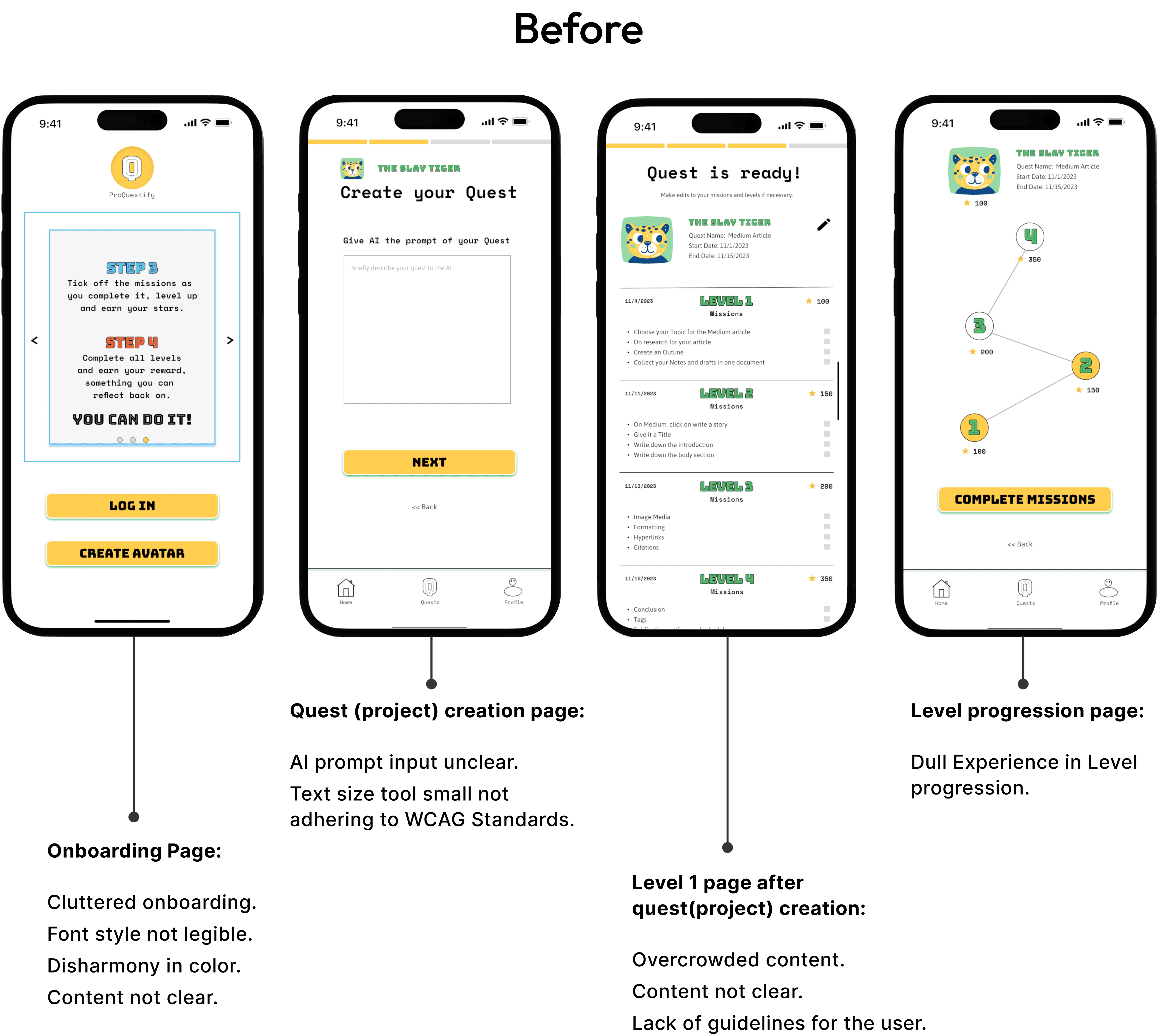
“The idea is great, but the design feels dull. I might use it at first, but I’m not sure it’ll hold my interest.”
The initial UI lacked the visual and interactive engagement users expected from a gamified experience. Pain points included:
Static, uninspiring design, and dull experience.
Overwhelming color palette.
Font choices affecting readability.
Unclear copy and content flow.

The Goal
Redesign the app considering all the issues raised from the previous user testing in regards to user pain points.
Addressing usability issues found in user testing.
Improving visual hierarchy and typography.
Adding dynamic and playful elements to elevate engagement.
Clarifying content to match users’ mental models.
My aim was to make the experience feel not just functional, but fun enough to keep coming back to.
Tools Used
Figma
Zoom for moderated user testing
Qualtrics for research
Adobe Illustrator
UX Tweaks for card sorting
UX Methods
Pain Point Mapping
Card Sorting
Heuristic Evaluation


Heuristic Evaluation → Pain Point Mapping → Card Sorting → Ideation → Wireframing → High-Fidelity Prototyping → User Testing → Iteration
✅ What worked well:
Users loved breaking projects into bite-sized tasks. It reduced overwhelm and made progress feel achievable.
⚠️ What needed improvement:
The design lacked dynamism. Users expressed concern that without interactive elements, the novelty would wear off.
🧠 Visual feedback was mixed:
Some praised the unique look, but others noted issues with legibility and clarity due to font and color choices.

Impact Highlights
Improved engagement through dynamic visuals and micro-interactions
Increased task completion confidence due to clear segmentation and progressio

Analysis from previously conducted User testing.
Core solution approach to tackling the problem was perceived positively.
The majority of participants responded positively to the app’s approach of breaking down projects into smaller, manageable tasks. This feedback validated the core design strategy for tackling procrastination and overwhelm: users found that smaller steps made the overall project feel more achievable. The fact that this method resonated well with users, it builds a strong support for continuing to use task segmentation as a means to reduce procrastination and keep users engaged in their progress.
Needs more dynamic experience.
One participant noted they would give the app a try but expressed uncertainty about long-term engagement, feeling that the experience might become too dull and eventually boring. This feedback highlighted the need for a more dynamic experience, with participants expressing interest in animations and additional gamified elements to keep the app engaging over time.
Found the visual style to be unique.
Some participants appreciated the unique visual style, finding it well-suited to the gamified concept. However, others raised concerns about certain design choices, specifically the use of multiple colors, small text sizes, and the selected font family. These insights highlight both the appeal and areas for refinement in creating a balanced and accessible visual experience.
Problems identified in the previous design.
User Pain Points
Dull Experience | Lack of Dynamism | Color Scheme Complexity | Small Text Sizes | Font Choice | Insufficient Explanations

"I grouped a mix of previous user testing participants and new participants interested in gamification to conduct pain point mapping and card sorting exercises. I gathered valuable qualitative insights from a total of 15 participants, brodening my understanding of user needs & preferences."
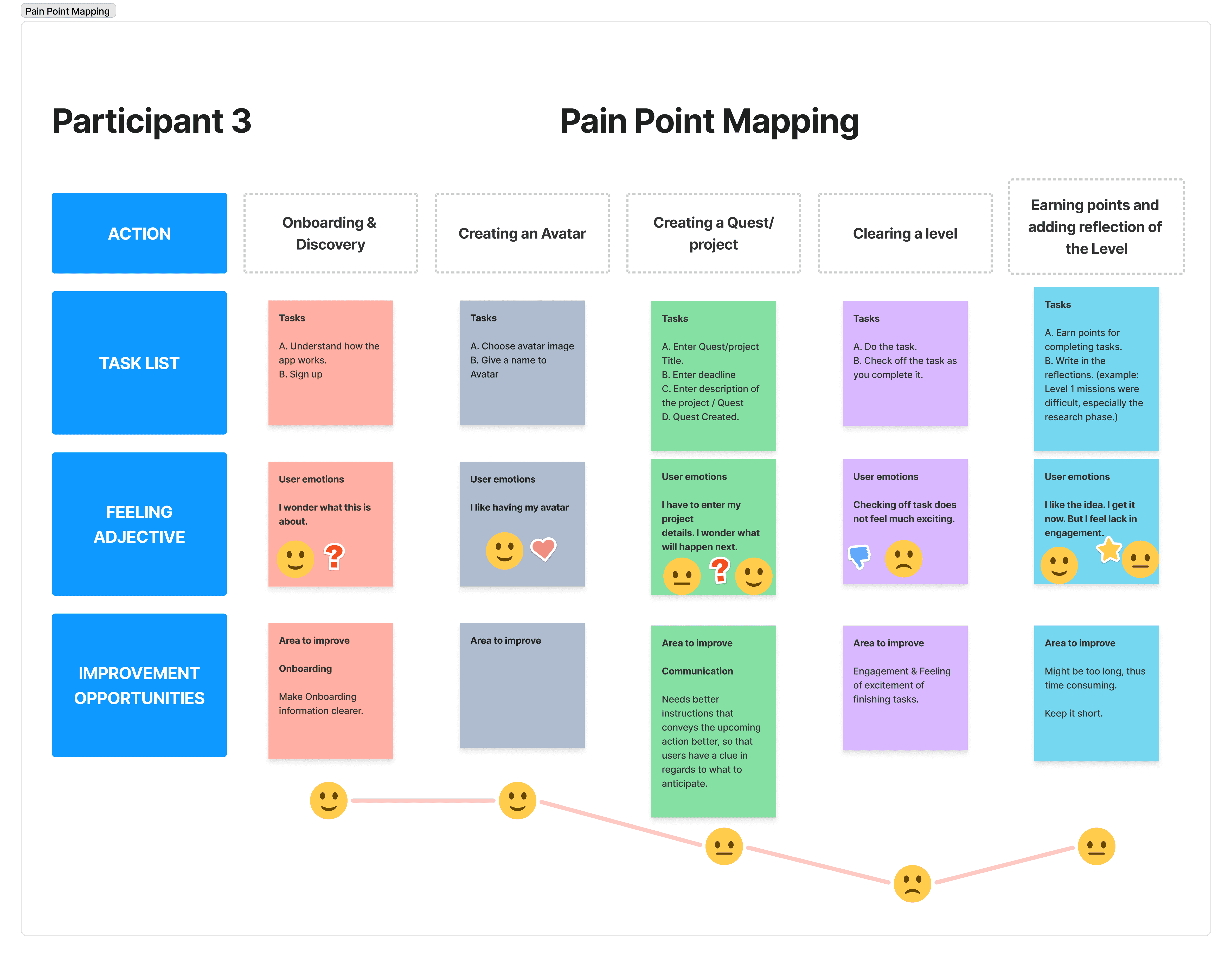
Pain point mapping to discover user frustations.
I engaged a mix of previous user testing participants and new participants with an interest in gamification to conduct pain point mapping and card sorting exercises. It enabled me to gather valuable qualitative insights from a total of 15 participants, enriching my understanding of user needs and preferences.
I conducted pain point mapping to deeply analyze where users encountered friction or frustration in their interactions with the app. I focused on several key UX metrics, including time on task, and user satisfaction scores to analyze the pain points.
Through this analysis, I found that users struggled with unclear information, and static design, which led to low user satisfaction, and prolonged task times. Additionally, I discovered that content delivery needed improvement for clarity, as users often felt unclear about what was happening.
The goal was to use these insights to redesign the app with a more intuitive and user-friendly interface, introducing clear navigation, improved information architecture, and engaging visual elements to enhance the overall user experience.
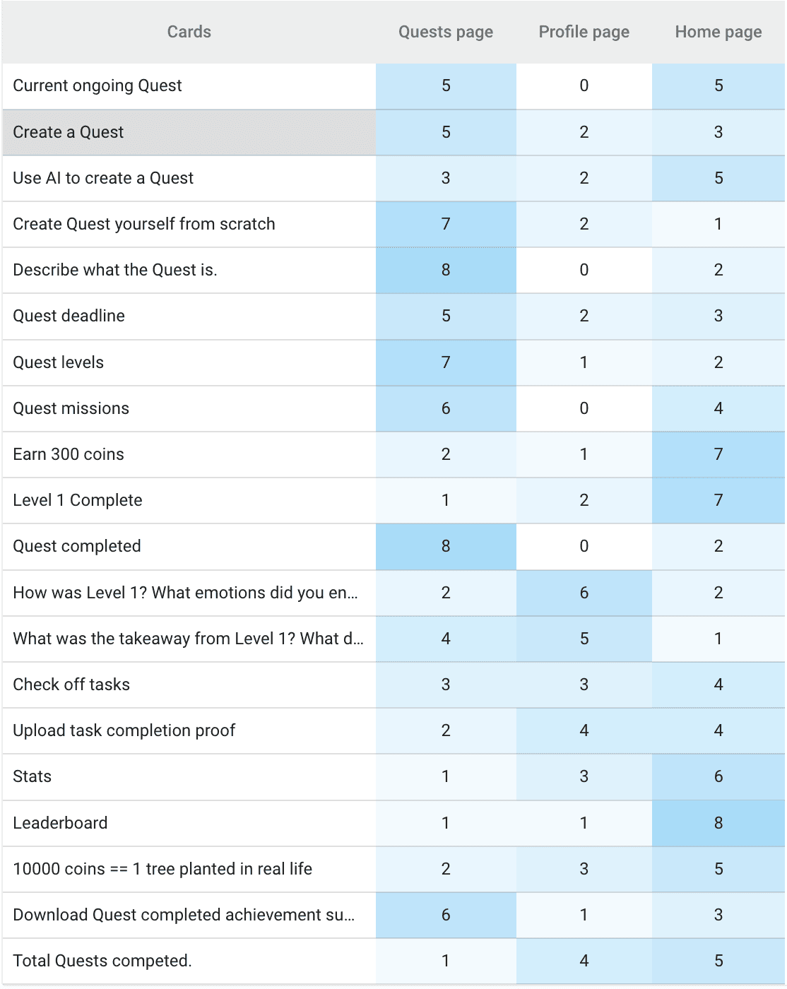
Card Sorting to Refine Information Architecture
To better understand users’ mental models, I conducted a card-sorting exercise aimed at improving the app’s information architecture. A gamified productivity app isn’t a typical concept, so it was crucial to understand how users naturally organize and think about tasks and features.
Through the analysis, I identified patterns in user groupings, focusing on frequent pairings of features, such as Quest Statistics and Downloading achievements, and noting any outliers where users were uncertain about categorization. These insights helped me restructure the app to align with user expectations, improving navigation and findability.
Design iterations and decisions based on user testing analysis.
Onboarding Page

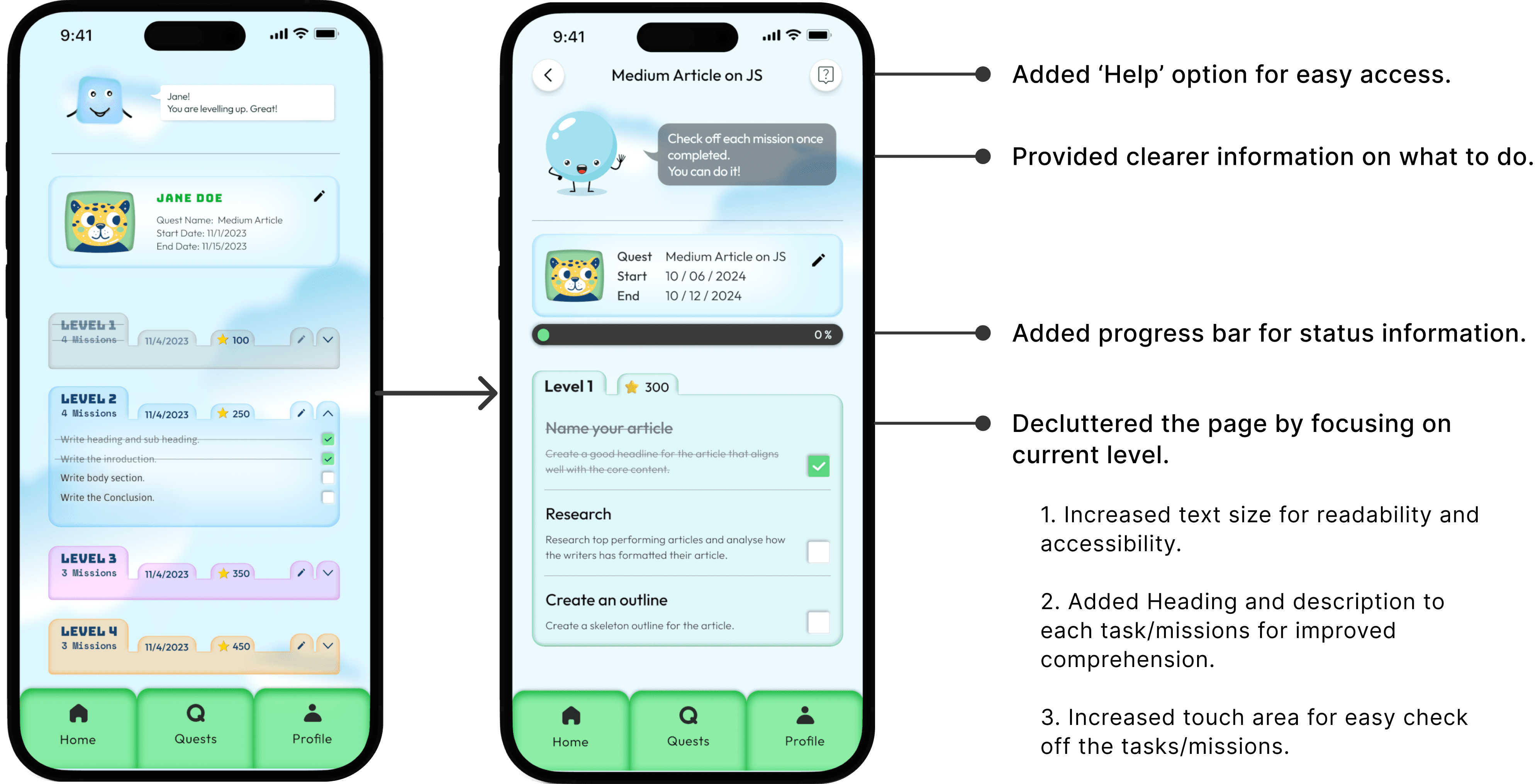
Level 1 page after the project quest creation
Quest (project) creation page

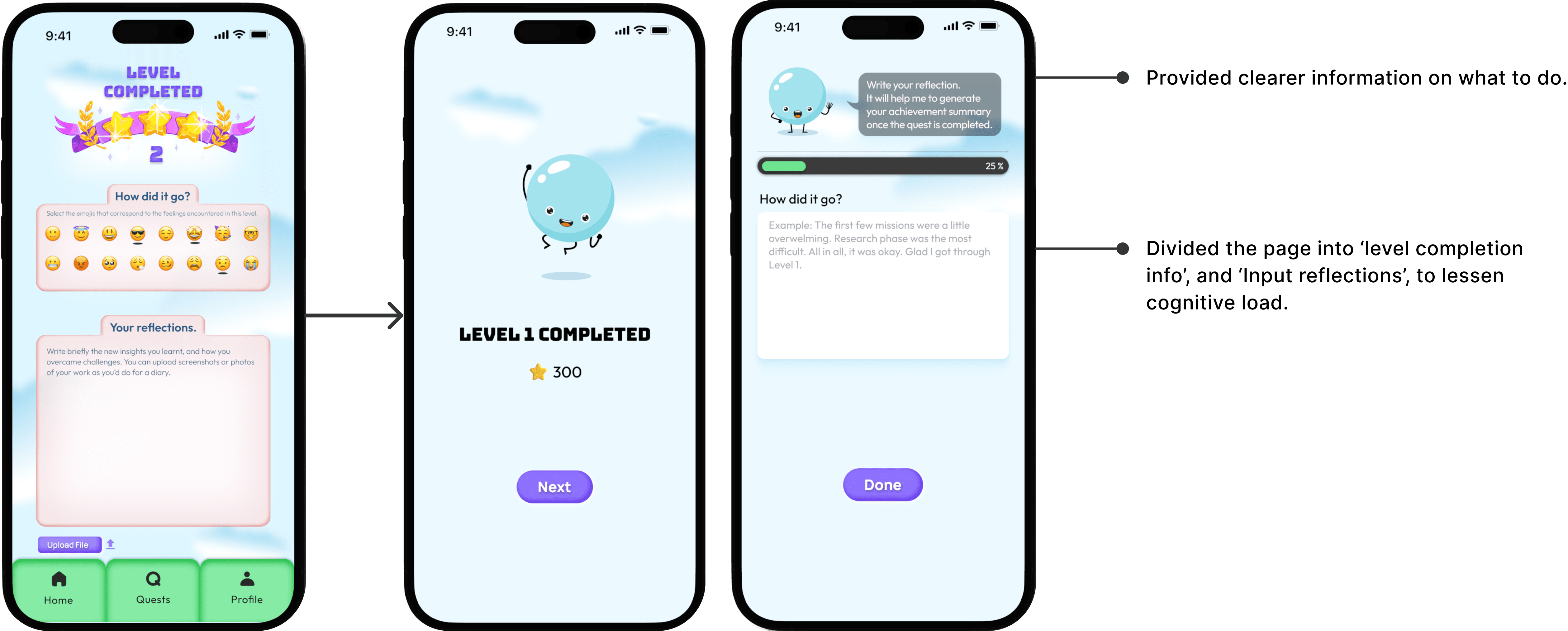
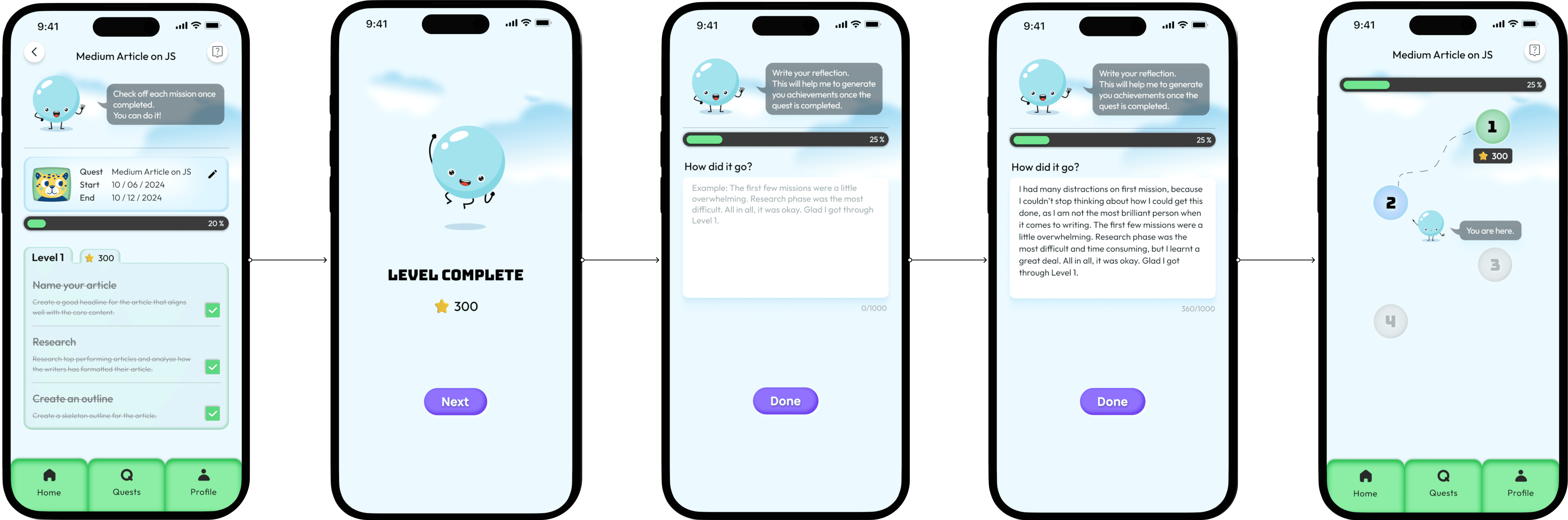
Level completion page followed by reflection input
Before and After comparisons

High-fidelity userflows

Quest (Project) Creation
I simplified the quest creation by requiring users to input only 3 elements, allowing the AI to break down the project into tasks. For those wanting full control, there’s an option to create tasks manually.

Edit Quest and finalize
For more customization, users can edit, add, or delete missions as needed. For instance, one user removed the task “Medium account” because they already had an account and didn’t need this step.

Level completion and reflection.
After completing a level, users earn star points and briefly reflect on their experience. These reflections are documented and can be downloaded once all levels are finished, helping users track achievements, boost motivation, and provide a dopamine boost.
Home page, Quest page & Profile page
Home Page: Insights from the card sorting exercise revealed users’ mental models, guiding me to position Statistics, Ongoing Quests, and a Call to Action Button to create a new quest on the home page.
Quest Page: The quest page directs users to pick up right where they left off in their project completion journey.
Profile Page: Users can view all their completed quests under Achievements, allowing them to review their progress, share, and download their journey.

Challenges encountered
1. Addressing the Engagement Deficit
Problem: The app’s dull, unresponsive design led to user disinterest, as it lacked engaging, interactive elements that invite exploration.
Approach: Introduced interactive components and dynamic visuals to enhance user engagement, making the experience feel lively and immersive to capture user attention through interactivity driving engagement.
2. Enhancing Accessibility and Visual Clarity
Problem: Complex color schemes, unsuitable fonts, and small text sizes made the app visually overwhelming and hindered readability, impacting overall usability and accessibility.
Approach: Simplified the color palette, adjusted text size to adhere to WCAG standards, and selected legible fonts to create a cleaner, more accessible interface. This improved visual clarity and usability, ensuring an inclusive experience that is easier to navigate and understand.
3. Closing the Guidance Gap
Problem: Users encountered uncertainty with the app’s functionalities due to limited explanations and unclear feature descriptions, impacting ease of use.
Approach: Integrated concise, context-sensitive guidance that explains key features in a straightforward, helpful manner.
"The biggest challenge was finding the right intersection where elements of gamification and productivity merged perfectly to create an engaging experience."
Reflection and upcoming steps
Lessons learned: I learned the importance of user feedback in shaping the design. Small usability improvements, such as increasing touch areas or simplifying instructions, significantly improved the overall user experience.”
Areas for further improvement: While the redesign improved the core user experience, there is still room to optimize the onboarding flow to better guide new users through the app’s unique features. There is still room for research in regards to the 'reward system' and iterate on it.
Upcoming steps: My upcoming steps would be to research what users want in regards to the 'reward system' and work on building more details and micro-interactions for improved user engagement. Another upcoming step is to conduct a second round of user testing and re-evaluate and re-iterate. I’ll focus on the following KPIs that provide insight into usability, engagement, and the overall effectiveness of design enhancements:
Task Completion Rate & Time on Task: To measure how easily users can complete actions with ease, and check for friction points to evalte and simplify further the user journey.
Feature Utilization: To observe which features are frequently used that will help me further understand user preferences and the appeal of specific elements, like the reward system. This can be used to guide me in future iterations.
User Satisfaction Score: Collecting qualitative feedback on overall satisfaction will provide insights into the emotional and functional impact of the app. Positive scores show alignment with user needs, while lower scores highlight areas to prioritize for improvement.


