Lose It! Themes

Lose It! Themes

Lose It! Themes

Designing a scalable personalization system for a daily health product

Designing a scalable personalization system for a daily health product

OVERVIEW

OVERVIEW

OVERVIEW

Premium themes should make a product feel more personal without making it harder to use.


At Lose It!, I led the design of a scalable theme system that powered 28 premium themes across iOS, iPadOS, and Android. Rather than creating individual theme artwork, I defined the rules, color system, accessibility standards, and selection experience that allowed every theme to feel expressive while protecting the health data people rely on every day.


The result was a repeatable system that made personalization easier to scale, easier to maintain, and consistent with the broader app redesign.

ROLE

ROLE

Visual design lead
Theme system
Accessibility

Theme selector

TEAM

TEAM

2 designers, PM, iOS, Android, and engineering partners

2 designers, PM, iOS, Android, and engineering partners

PLATFORM

PLATFORM

iOS

iPadOS

Android

IMPACT

IMPACT

Repeatable system for 28 themes, with adoption tracked in Amplitude

TIMELINE

TIMELINE

8-week design and implementation track

ROLE

Visual design lead
Theme system
Accessibility

Theme selector

PLATFORM

iOS

iPadOS

Android

TIMELINE

8-week design and implementation track

TEAM

2 designers, PM, iOS, Android, and engineering partners

IMPACT

Repeatable system for 28 themes, with adoption tracked in Amplitude

The Challenge

The Challenge

The Challenge

Lose It! is a product people open multiple times every day. That changes how you think about personalization.


A beautiful interface means very little if it makes calories, streaks, or progress harder to read after weeks of use.

The challenge wasn't designing twenty-eight beautiful themes. It was creating one system that could support twenty-eight different visual identities while keeping the experience familiar, accessible, and easy to maintain.


Each theme also needed to work within the new redesigned header, and existing design system instead of introducing custom components or one-off behaviors.

Lose It! is a product people open multiple times every day. That changes how you think about personalization.


A beautiful interface means very little if it makes calories, streaks, or progress harder to read after weeks of use.

The challenge wasn't designing twenty-eight beautiful themes. It was creating one system that could support twenty-eight different visual identities while keeping the experience familiar, accessible, and easy to maintain.


Each theme also needed to work within the new redesigned header, and existing design system instead of introducing custom components or one-off behaviors.

Lose It! is a product people open multiple times every day. That changes how you think about personalization.


A beautiful interface means very little if it makes calories, streaks, or progress harder to read after weeks of use.

The challenge wasn't designing twenty-eight beautiful themes. It was creating one system that could support twenty-eight different visual identities while keeping the experience familiar, accessible, and easy to maintain.


Each theme also needed to work within the new redesigned header, and existing design system instead of introducing custom components or one-off behaviors.

Old Cats Theme - Android

Old Cats Theme - Android

Old Cats Theme - Android

Constraints that shaped the system

Constraints that shaped the system

Constraints that shaped the system

Accessibility came first. Every theme had to maintain clear contrast for health data, text, and interactive elements.


Themes had to work within the design system. No custom components or one-off UI that couldn't scale.


Cultural themes required thoughtful research. They needed to feel authentic and respectful, not generic or performative.


The workflow had to scale. New themes should be easy to create without redesigning the product each time.

The Goal

The Goal

The Goal

Create a scalable theme system where every theme feels expressive while preserving clarity, accessibility, and consistency across the product.

WCAG ACCESSIBILITY

WCAG ACCESSIBILITY

Text & data over every themed header must pass accessibility standards

CULTURAL AUTHENTICITY

CULTURAL AUTHENTICITY

Design through research, not assumptions

ONE DESIGN SYSTEM

ONE DESIGN SYSTEM

Build every theme on the same components and tokens

Build every theme on the same components and tokens

SCALABLE WORKFLOW

SCALABLE WORKFLOW

New themes ship easily, without redesign work

New themes ship easily, without redesign work

WCAG ACCESSIBILITY

Text & data over every themed header must pass accessibility standards

ONE DESIGN SYSTEM

Build every theme on the same components and tokens

CULTURAL AUTHENTICITY

Design through research, not assumptions

SCALABLE WORKFLOW

New themes ship easily, without redesign work

Key Design Decisions

Key Design Decisions

Key Design Decisions

The work was less about drawing 30 beautiful headers and more about defining the rules that made thirty expressions usable, shippable, and maintainable.

The work was less about drawing 30 beautiful headers and more about defining the rules that made thirty expressions usable, shippable, and maintainable.

The work was less about drawing 30 beautiful headers and more about defining the rules that made thirty expressions usable, shippable, and maintainable.

01 — Design One System Instead of 28 Themes

01 — Design One System Instead of 28 Themes

01 — Design One System Instead of 28 Themes

OVERVIEW

OVERVIEW

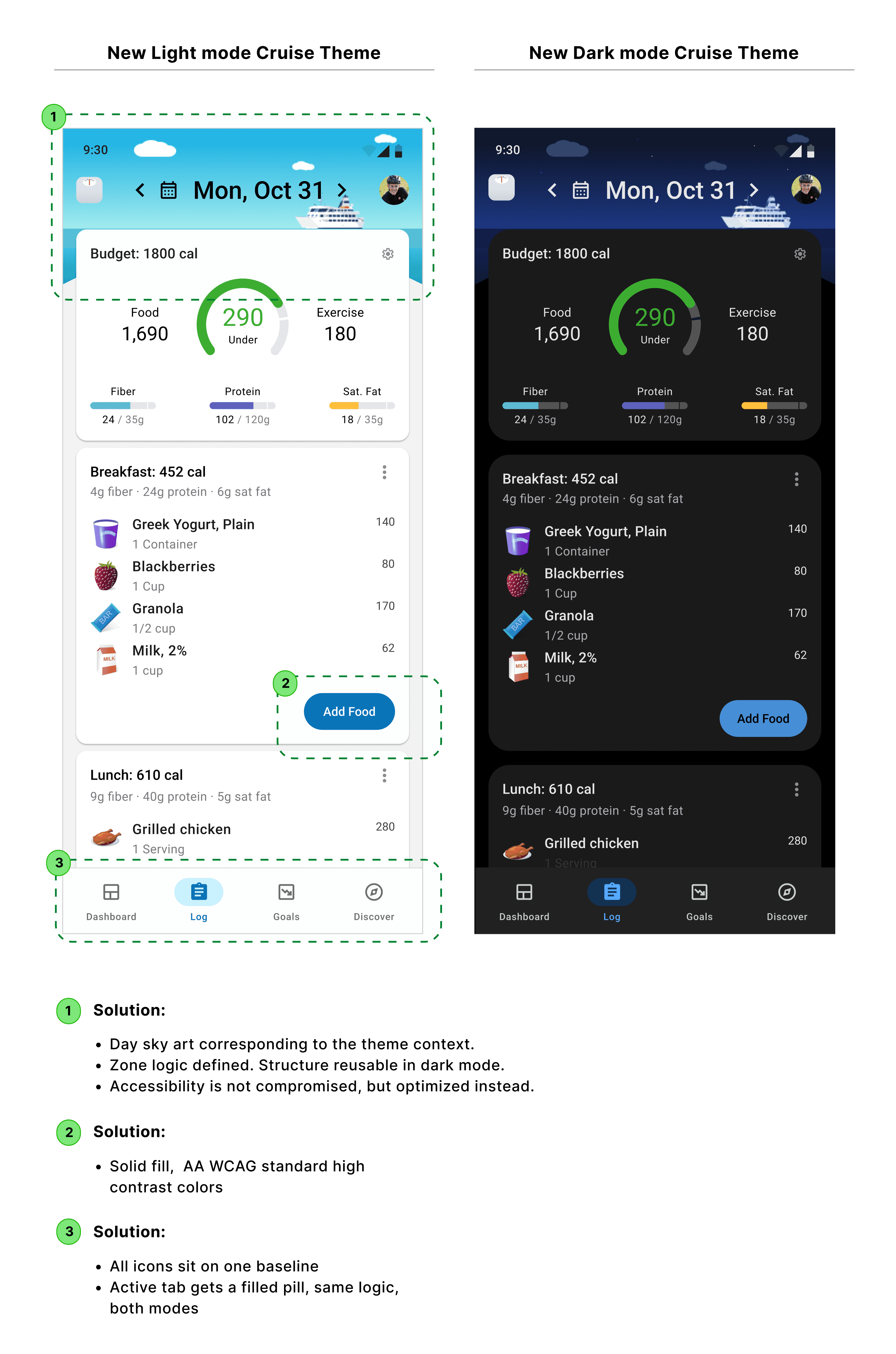
Instead of treating every theme as its own design project, I created a shared framework with protected areas for data and expressive areas for illustration and color.


This gave every theme its own personality while ensuring the interface stayed familiar no matter which theme someone chose.

Instead of treating every theme as its own design project, I created a shared framework with protected areas for data and expressive areas for illustration and color.


This gave every theme its own personality while ensuring the interface stayed familiar no matter which theme someone chose.

TRADEOFF

TRADEOFF

Some themes became less visually ambitious than they could have been, but consistency mattered more than novelty. A daily product should feel dependable before it feels decorative.

02 — Make Accessibility Part of the Creative Process

02 — Make Accessibility Part of the Creative Process

02 — Make Accessibility Part of the Creative Process

OVERVIEW

OVERVIEW

Bright seasonal colors and illustrated backgrounds often compete with readability.


Rather than treating accessibility as a final QA step, I incorporated it into the design process from the beginning. Color palettes, layered scrims, and foreground treatments were all designed to preserve hierarchy while allowing each theme to maintain its own visual character.

Bright seasonal colors and illustrated backgrounds often compete with readability.


Rather than treating accessibility as a final QA step, I incorporated it into the design process from the beginning. Color palettes, layered scrims, and foreground treatments were all designed to preserve hierarchy while allowing each theme to maintain its own visual character.

TRADEOFF

TRADEOFF

Health data, and related crucial navigational informations always came first. The theme should support the experience, never compete with it.

Health data, and related crucial navigational informations always came first. The theme should support the experience, never compete with it.

03 — Design Cultural Themes with Research, Not Assumptions

03 — Design Cultural Themes with Research, Not Assumptions

03 — Design Cultural Themes with Research, Not Assumptions

OVERVIEW

OVERVIEW

Themes celebrating Pride, Hanukkah, International Women's Day, and other cultural moments deserved more than familiar visual clichés.


I researched symbolism, color meaning, and existing visual language to understand what felt authentic and what risked feeling performative. The goal wasn't simply to make themes recognizable. It was to create designs people would feel comfortable using long after the initial launch.

Themes celebrating Pride, Hanukkah, International Women's Day, and other cultural moments deserved more than familiar visual clichés.


I researched symbolism, color meaning, and existing visual language to understand what felt authentic and what risked feeling performative. The goal wasn't simply to make themes recognizable. It was to create designs people would feel comfortable using long after the initial launch.

TRADEOFF

TRADEOFF

The strongest solution wasn't always the loudest one. Sometimes restraint communicated more respect than adding another symbolic element.

The strongest solution wasn't always the loudest one. Sometimes restraint communicated more respect than adding another symbolic element.

04 — Turn the Theme Selector into a Premium Experience

04 — Turn the Theme Selector into a Premium Experience

04 — Turn the Theme Selector into a Premium Experience

OVERVIEW

OVERVIEW

The theme selector became more than a settings page. It became one of the product's strongest premium moments.


Subscribers could quickly browse, compare, and preview themes while understanding that personalization extended beyond colors alone. For free users, the selector also served as a preview of the value available in Premium without making the core experience feel restricted.

The theme selector became more than a settings page. It became one of the product's strongest premium moments.


Subscribers could quickly browse, compare, and preview themes while understanding that personalization extended beyond colors alone. For free users, the selector also served as a preview of the value available in Premium without making the core experience feel restricted.

TRADEOFF

TRADEOFF

Showing too much at once created decision fatigue. The experience needed to inspire exploration while helping users choose confidently.

Showing too much at once created decision fatigue. The experience needed to inspire exploration while helping users choose confidently.

Craft: 28 themes, one product language

Craft: 28 themes, one product language

Craft: 28 themes, one product language

Every theme used the same underlying structure: protected data zones, defined palette roles, accessible foreground colors, and expressive artwork that could change without destabilizing the interface.

Every theme used the same underlying structure: protected data zones, defined palette roles, accessible foreground colors, and expressive artwork that could change without destabilizing the interface.

Every theme used the same underlying structure: protected data zones, defined palette roles, accessible foreground colors, and expressive artwork that could change without destabilizing the interface.

The Outcome

The Outcome

The Outcome

The theme system shipped as part of the larger redesign and established a repeatable framework for launching seasonal, cultural, and promotional themes without redesigning the product each time.


More importantly, it made personalization feel like a meaningful part of the Premium experience rather than a collection of isolated visual skins.

The theme system shipped as part of the larger redesign and established a repeatable framework for launching seasonal, cultural, and promotional themes without redesigning the product each time.


More importantly, it made personalization feel like a meaningful part of the Premium experience rather than a collection of isolated visual skins.

28

28

Themes shipped through one repeatable system

Accessibility

Accessibility

Protected data readability across expressive seasonal themes

Premium value

Premium value

Made personalization visible in the product, not only in marketing

Made personalization visible in the product, not only in marketing

Reflection

Reflection

Reflection

This project changed how I think about personalization. The challenge wasn't creating twenty-eight beautiful headers. It was designing a system that allowed twenty-eight different identities to exist without weakening usability, accessibility, or trust.


It reinforced a lesson I continue to apply today: the best visual systems don't ask users to choose between personality and clarity. They make both possible.

This project changed how I think about personalization. The challenge wasn't creating twenty-eight beautiful headers. It was designing a system that allowed twenty-eight different identities to exist without weakening usability, accessibility, or trust.


It reinforced a lesson I continue to apply today: the best visual systems don't ask users to choose between personality and clarity. They make both possible.

What's Next

What's Next

What's Next

The next opportunity is to make the system even smarter.


I'd study trends and use product analytics to understand which themes drive the most engagement, which seasonal moments deserve new themes, and how personalization influences Premium retention over time.


I'd also expand the system to support AI-assisted theme creation. With a strong design system already in place, AI can help accelerate concept exploration and visual iteration while the system continues to enforce accessibility, brand consistency, and product quality. The goal isn't to automate design. It's to help designers explore more ideas while maintaining a high bar for the final experience.

The next opportunity is to make the system even smarter.


I'd study trends and use product analytics to understand which themes drive the most engagement, which seasonal moments deserve new themes, and how personalization influences Premium retention over time.


I'd also expand the system to support AI-assisted theme creation. With a strong design system already in place, AI can help accelerate concept exploration and visual iteration while the system continues to enforce accessibility, brand consistency, and product quality. The goal isn't to automate design. It's to help designers explore more ideas while maintaining a high bar for the final experience.

Copyright © 2024. Silu Manandhar

Copyright © 2024. Silu Manandhar